I wish a happy and peaceful 2022 to all. The last two years have played out in a bit of a haze (lockdown began March 15 2020), but with getting back regularly to the studio, and latterly the Test Space Residency in LCGA, creatively things are moving.
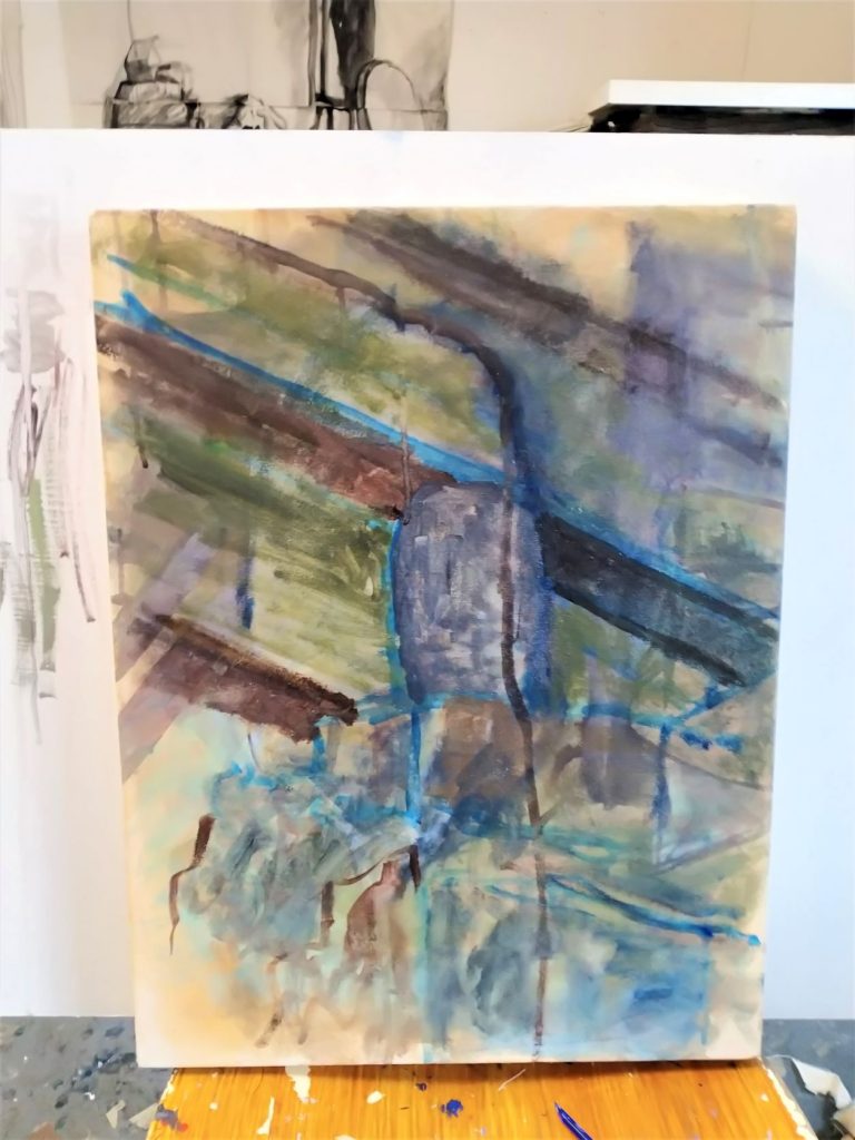
I am concentrating on painting again, particularly on canvas, and the above image is the first layer of one (of two). The works depict a couple of views from a seated position in my studio, and have been occupying me for the last 10 weeks or so. I always draw with the brush(es) when painting. It is another way to relax the outcome and the wrist. Using a pencil or other media to begin a work tends to tighten and restrict I feel.

Stage 2.
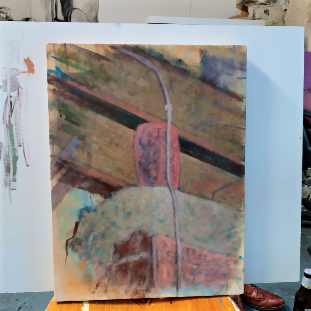
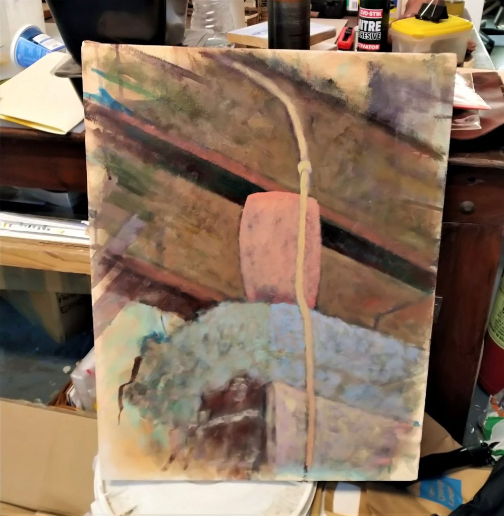
This particular piece is a vase of some sort above the back door lintel. The colour is quite exceptional -an electric pink – very much what we would call ‘plastic’. It’s quite an unusual composition, but I’m (quietly) confident it will work out. Working with canvas so much again brings back the old techniques and solutions, while at the same time the lack of practice can bring new approaches.
As can be seen above, the painting is built from the background up. The second image is after about four layers – dry paint (no medium like turps/oil added) is built up gradually, worked into the fabric, the darker and underlying colours (in my eyes!) being the base. These patchy bits, disguised more and more with each layer, go on to have a significant, but very subtle effect on the eye, particularly after the last stage of glazing.

This is where I am now with it (ignoring the brutal quality of the photos of course). The more solid and defined image is emerging. When we get to a point where it feels ‘real’, I will add a few layers of glazing -the oil painting equivalent of a water-colour wash – the image will rescind or diminish, leaving us with a more cohesive, moody work.
A question I, and many others have when beginning to pursue painting/visual art had, was what purpose does colour have? It may seem a simple question. Yes if we want to be faithful to a scene, and want to recreate it then we use similar colours. But what else is it for? Put simply, adding colours through glazes/washes sets a mood, and provides the audience with a lens to judge it. Say we have a scene and apply a red glaze – it is uneasy, and makes us think of danger. A blue glaze makes it feel cold/depressed and so on.

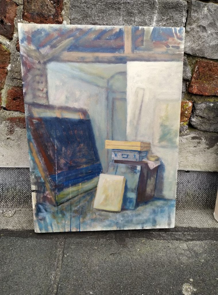
The above work was also done from the same seated position, and took about six weeks or so. I’m figuring out what colours I’ll apply to soften and enhance the feel and mood. Most likely I’ll use a lemon yellow to start with – really drawing out the acidic feel, and a little uncomfortable on the eye. After that a soft, perhaps pinkish hue. There may be another one, but we are on the home stretch(er).
Tá suil agam go bhfuil an bliain seo go mhaith ar son go léir.
Peace out.